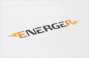
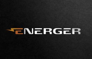
Our highest priority was to meet the owner’s expectations. He needed energetic colors, such as red or orange combined with black, but also a professional and presentable version in duotone (without colors). The logo needed to fit within a wide rectangle so that it could be freely stamped onto batteries. Typographically, we were going for something similar to the Sony logo, with a subtle accent on electrical power.
Although we weren’t able to find a winner at the very beginning, the feedback we got after consulting with the client gave as all we needed to come up with one.
Reconsideration of our initial ideas in cooperation with the client led us towards the right design in the second round of the process. .
But the winning combination of elements had not yet been perfected. After some further thought, we decided to remove the second arrow from the letter “r.” Voila! We found what we had been looking for.
The experience that Juicy Logos has in dealing with
tough designs turned out to be really valuable
in my case. I can therefore honestly
recommend them as the right
partner to work with.
I am greatly satisfied with
our cooperation.
Chairman of the board
Thomas Krüger