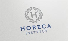
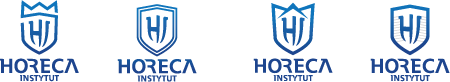
What they needed. The company offers exclusive coaching sessions that are not the cheapest on the market, and their logo needed to reflect this. Ideally, the design would include the initials “H” or “HI.” So we then came up with 4 promising solutions, each with its own, distinctive character. Every option provoked a discussion, which, although it didn’t lead to the perfect solution right away, gave us just enough clues to find it.

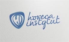
The company shield presented in design option 2 needed to be further developed, but the text caption in option 4 was just right. We thus modified the shield to be congruent with the rest of the typography. However – although we strongly support minimalism for numerous reasons – our client thought our creation was too simple and lacked “that special something.” So we presented 4 additional solutions using another shield symbol. That’s how we got our winner.

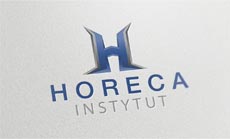
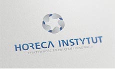
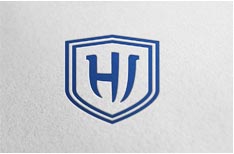
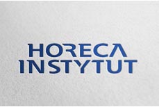
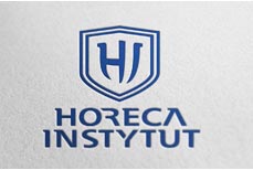
The winning design consisted of the initials, adapted to the shape of a shield, with two outlines to symbolize double efficiency. The final design could be displayed both vertically and horizontally, depending on the size of the available space. This made for a logo that was more universal, as can be seen below.
Coming up with a logo for our institute was
the most important part of the whole undertaking,
and the design provided by Juicy Logos was exactly what we needed.
I recommend Juicy Logos to anyone who needs a recognizable business brand.